Cliente: Instituto França Barros
Segmento: Education, Human Development & Institutional Growth
Ano: 2023
Serviços: Visual Identity, Visual System, Creative Direction, and Brand Guidelines
Objetivo do Projeto: To develop an institutional identity capable of translating the values of growth, heritage, and human development that define Institut França Barros, creating a solid, memorable communication system designed to strengthen its presence and recognition across multiple touchpoints.
#Branding #Logo #Identity
Institut França Barros is an organization built upon the values of growth, heritage, and human development, fostering a communication approach that combines tradition, proximity, and structure. The project sought to visually translate these pillars into a solid, elegant, and memorable identity capable of strengthening the institution's perception across different touchpoints.
The challenge was to create an identity that balanced symbolism, legibility, and sophistication, connecting the historical elements of the França and Barros family names with a contemporary and versatile visual language. The brand needed to communicate growth and strength without sacrificing visual lightness, while also ensuring consistency across both digital and print applications.
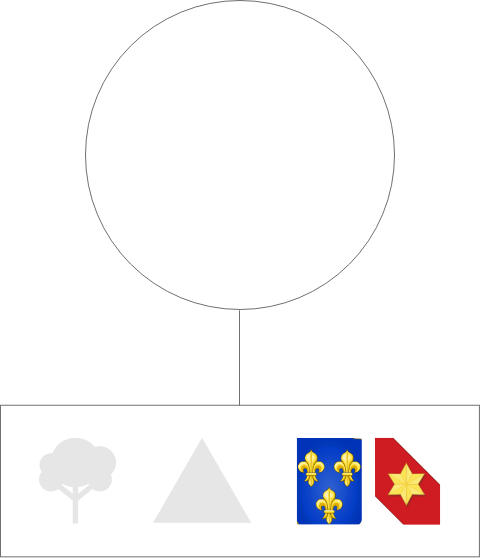
The solution was built around a symbol inspired by the families' coats of arms, the shape of a tree, and triangular geometry as a representation of foundation, strength, and development. The entire identity was structured using modular grids, refined typography, and an institutional color palette based on shades of blue that reinforce trust, harmony, and reliability. The result is a contemporary, institutional, and symbolic brand prepared to communicate its values with clarity and consistency.

The Institut França Barros project was developed to create an institutional identity capable of translating its values of growth, heritage, and human development into a strong and contemporary visual language. We developed the brand strategy, visual identity, and graphic system, creating communication that is consistent, symbolic, and memorable.
The result is a brand designed to strengthen its institutional presence and communicate purpose, trust, and development across all of its touchpoints.



The Institut França Barros symbol was inspired by three fundamental pillars: heritage, growth, and strength. Its construction combines references to the França and Barros family coats of arms with the shape of a tree, representing continuous development, supported by a triangular foundation—the strongest geometric structure.
The result is a symbol that communicates strong roots, evolution, and legacy building.
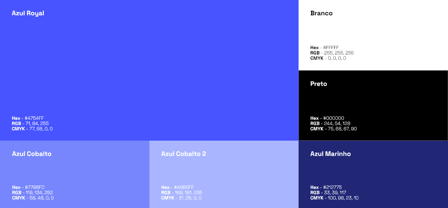
The Institut França Barros color palette was developed to communicate trust, harmony, and institutional strength. With blue as the primary color, the brand conveys security, productivity, and credibility, while complementary shades create depth and visual balance.
The use of black and white reinforces sophistication and clarity in communication, resulting in a professional, welcoming, and timeless identity.

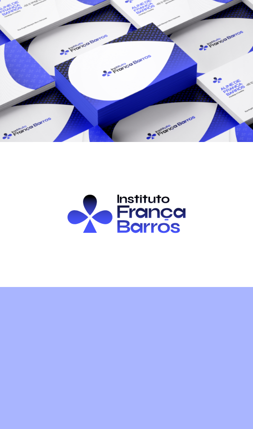
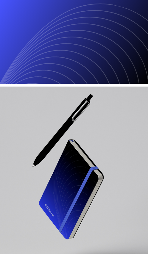
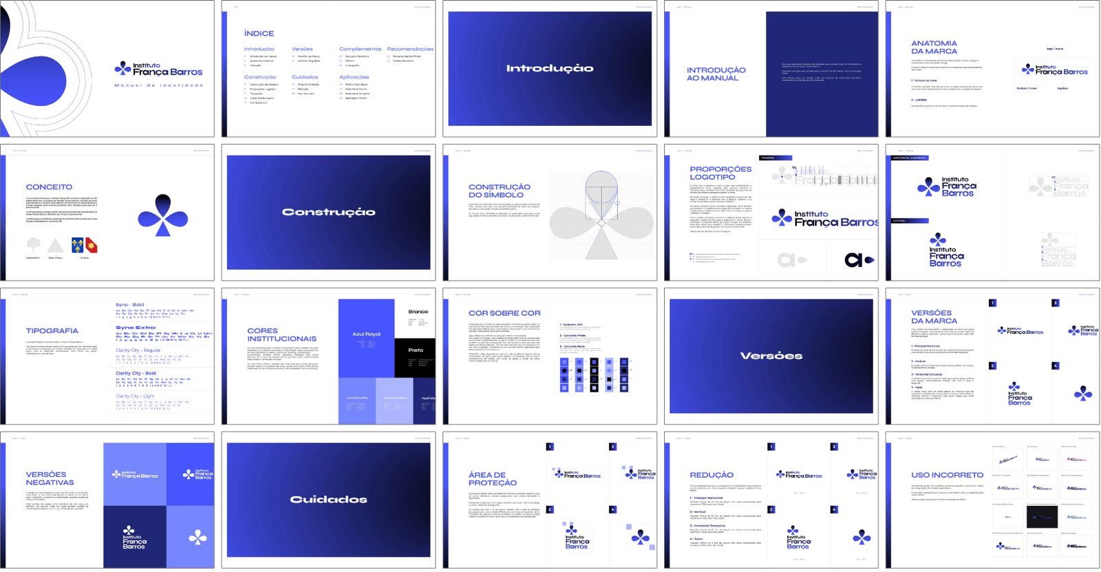
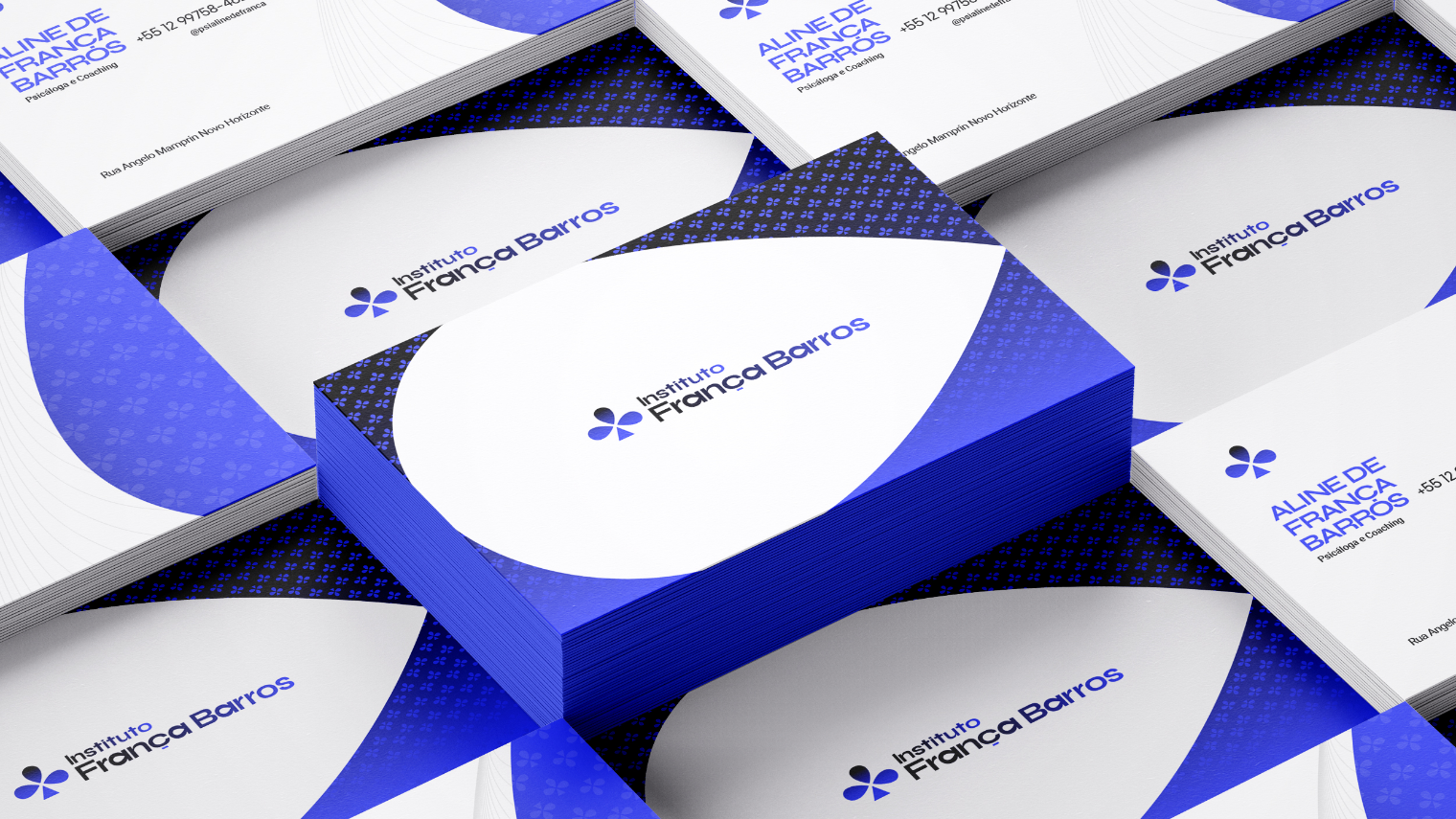
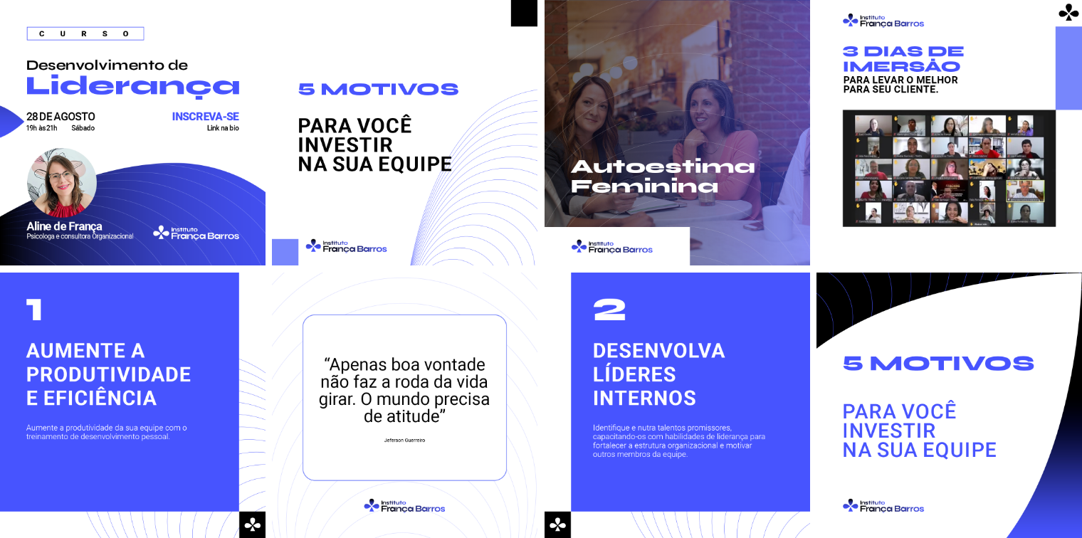
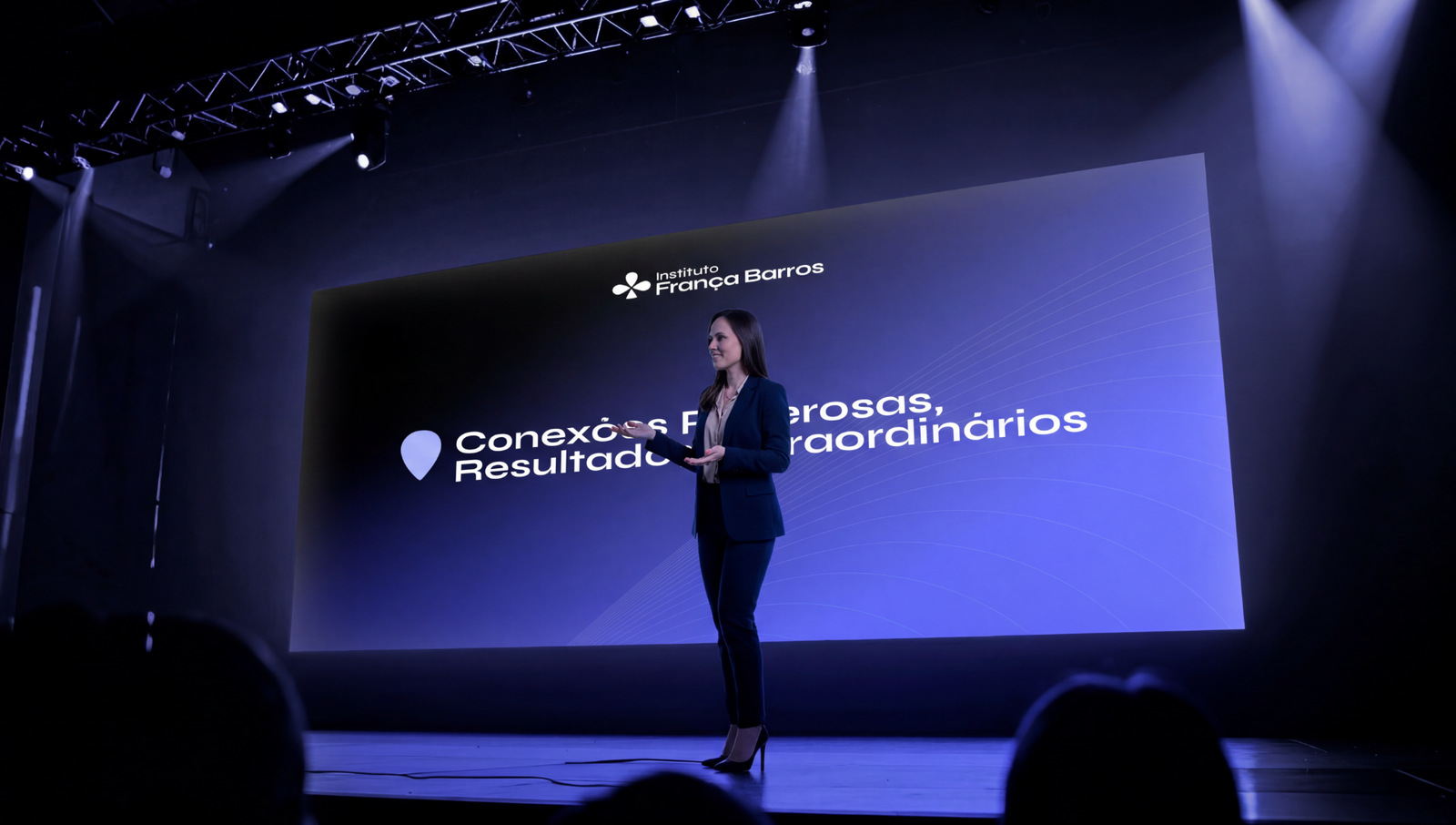
The brand application system was designed to ensure consistency and recognition across different contexts, from institutional materials to digital environments.
The visual system uses the symbol, its derived elements, and graphic patterns as communication assets, strengthening the brand identity in a cohesive, elegant, and memorable way across every touchpoint.